
IN


The
Institute for Natural System Engineering located in the Utah Water Research Laboratory
at Utah State University is currently involved in hydraulic and habitat analysis of
the
Through dialogue between Connelly
Baldwin, Cynthia Tyler of INSE and me, the idea of comparing data
obtained using different
resolution DEMs came about.
Specifically, a comparison of Drainage density
obtained using three different
delineation methods of a constant drop analysis.
It is my understanding that
similar test will be done by INSE and may eventually be available to compare
with the results found through the
process I used.
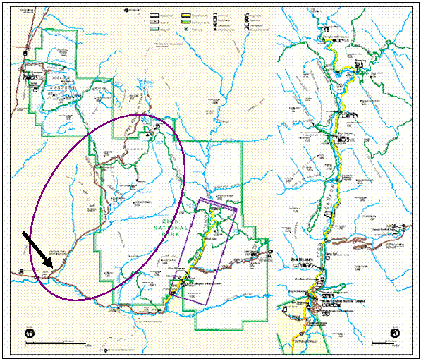
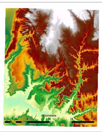
The
North Creek tributary of the
Also located in
of the
The National Park Service has a
.pdf map along with area map and various other features available for download here.
The 10 m and 30 m DEMs I used were
originally obtained from the State of
Information
Technology Services Automated
Geographic Reference Center (AGRC).
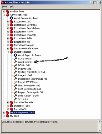
They come
in an ASCII file format which needs to be converted to grid. I used the Arc Toolbox
features to
accomplish this. Go into the ‘Conversion
tools’ options and choose ‘Import to Raster’ and
then select
‘ASCII to Grid’. Follow the steps it
asked for and you should get a Raster Grid usable in ArcGIS.
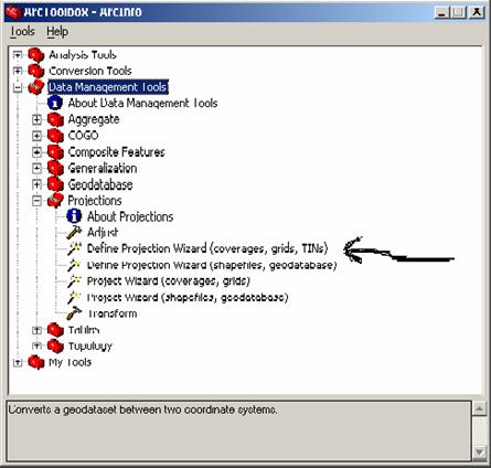
I then projected them into the projection I wanted using
Arc Toolbox again. Open ‘Data Management
Tools’,
and then open ‘Projections’ and chose ‘Define Projection
Wizard.’ Follow through the steps asked
for and the final result should end up as UTM Zone 12, NAD
83.
After
opening the layers up in ArcView I noticed they were not connected to each
other. I found that software has been
written to
easily join these grids into one. Using Sinmap, a
downloadable extension for ArcView, it is possible to join
adjacent grids. The function of mosaic was chosen over merge
because of my understanding of the interpolation procedure
used in
mosaic, whereas merge overwrites common data points with the one that was there
first. After doing the above,
I was told
that Arc/Info has a function in Grid that will mosaic adjacent grids also.

There is
one intermediate step that needed to be performed after using Sinmap. I found the 30 m DEMs
had points
of no data where the grids had been joined together. The problem with having a grid cell with
a no data
cell is the way TauDEM assigns values from contributing cells down the stream network.
This is
also a problem with edge contamination.
A program such as gapfil.exe
can be used to fill in these
gaps in the
interior of the grid. With these
problems rectified, I could then proceed and run TauDEM
to do the
comparison.
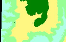
Notice that the
black border and points within the grid represent points of no data.![]()
![]()
Within
ArcMap the stream network and watershed delineation toolbar of TauDEM needs to be added.
Following the automatic
preprocessing will allow you to evaluate the grid by the upwards curvature
method.
There are three ways I used to
evaluate the grids.
- Upward
curvature
- Contributing
area threshold
- Grid
order threshold
These are options in the terrain
analysis program and are explained on the TauDEM download page. The first
comparison will be made by upward
curvature. Finding an acceptable
threshold takes some trial and error,
which takes considerably longer
with the larger data set. In order to
find a realistic network of streams,
a comparison of the results with the
contour layer should be made. I used
Spatial Analyst to produce the
contour maps. First I loaded the Spatial Analyst Toolbar
and selected the base DEM appropriately before running.
From the Spatial Analyst menu bar
select ‘Surface Analysis’ and then chose ‘Contour.’
This produced the following pair
of Contour maps.
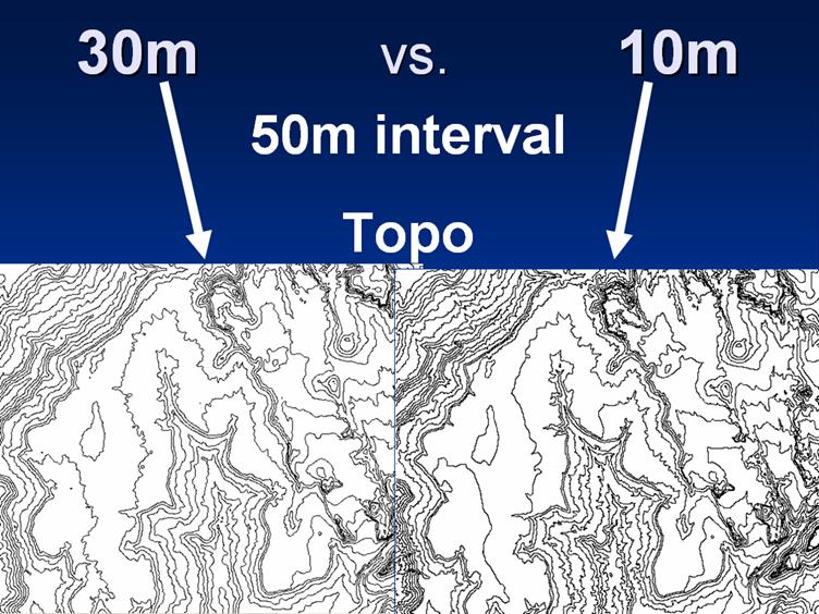
As expected the contour lines had
minor differences resulting from the different resolutions.
This can most likely be the reason
for the difference in flow paths between the 10 m and 30 m DEMs.
The threshold can be adjusted to
smooth percent differences in Drainage density, however
these adjustments are not large
enough to affect the outcome significantly.
As seen by the green stream network, not all stream
delineations are reasonable. Take a
look at the result different thresholds produced here. Notice the large amount of first and
second order streams.
Along with the contour analysis I
compared the methods against each other.
By overlaying
stream networks derived from the
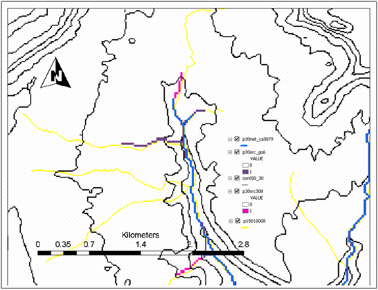
10 m and 30 m DEMs the differences can be viewed.
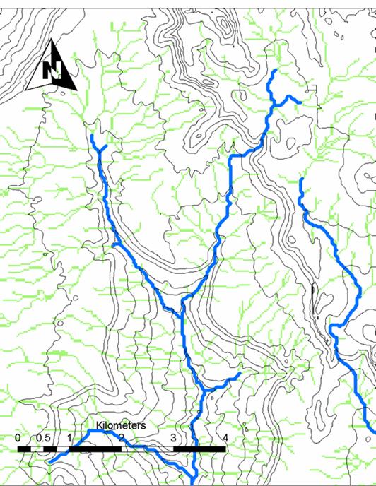
The following shows the results
for the both the 10 m (p10src_1091, blue) and the 30 m (p30src_308, pink).
By overlaying stream networks
derived from the 10 m and 30 m DEMs the differences can be viewed
As expected stream paths differ
slightly most likely due to the different data sets that are used to calculated
them.
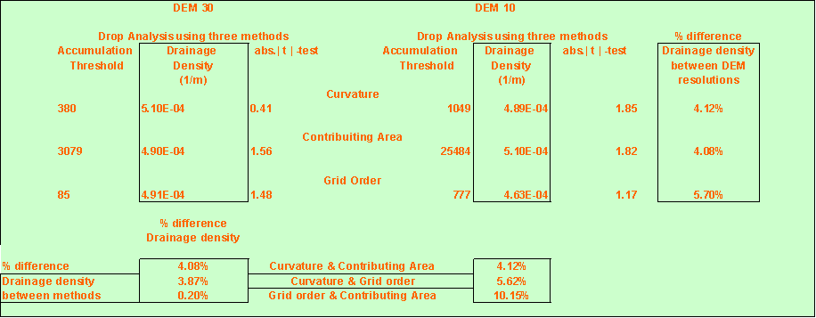
The difference in Drainage density
between these two was about 4.1%.
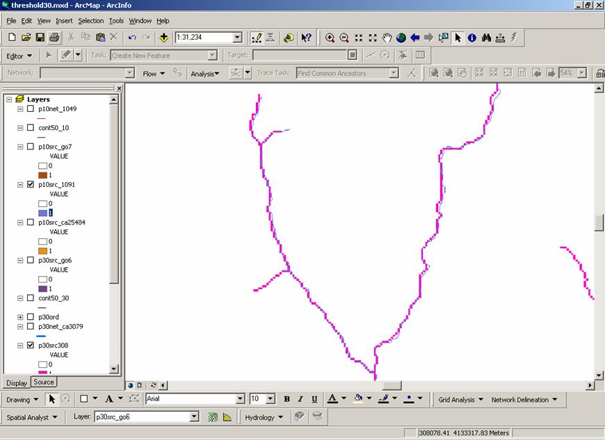
The next comparison was made
between the Grid order thresholds.
The variance here seems to be
greater than seen previously with the curvature method. The difference in Drainage density is about 5.7%.
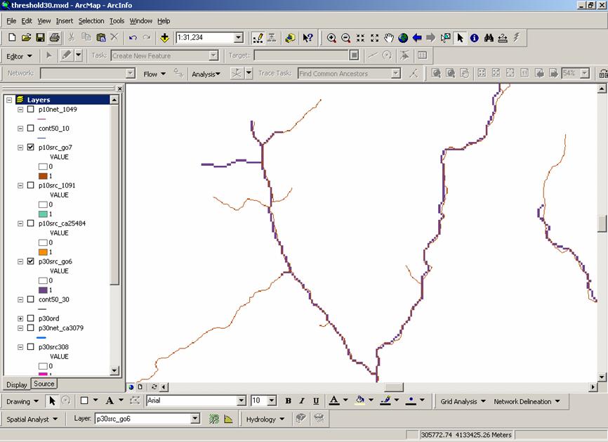
The last comparison is between the
Contributing area method.
There is still some variance, but
this comparison had the least amount of difference between the Drainage
densities with 4.08%.
A table of the results I obtained
is given with the percent difference between the 10 m and 30 m DEMs.
Also given is the comparison
between methods as a percent difference.
The threshold can be adjusted to
smooth percent differences in Drainage density, however these adjustments are
not large
enough to affect the outcome
significantly. To further analyze the
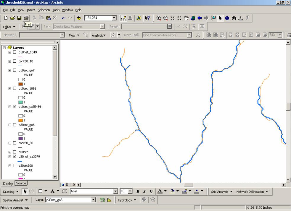
network of streams produced, I obtained the NHD
coverage of streams for this
area.
The picture illustrates the
differences produced for the 30 m DEM.
The comparison is as follows:
- The
Yellow lines represent the NHD
data set for this drainage.
- The
Violet lines represent the Grid order threshold
method.
- The
Pink lines represent the upward curvature
method.
- The
Blue lines represent the Contributing area
method.
Doing the same analysis with the
stream network created by the 10 m DEM produces a network that more closely
emulates
that of the NHD. Stream networks cross
contour lines at clearly defined crenulations.
Whereas, with the 30 m DEM
delineated network, it can be seen
that some stream networks cross contour lines in places that are not clearly
obvious.
It appears the thresholds I chose
were more conservative than that of the NHD. Notice how the yellow lines extend farther
than any produced by the methods
listed.
One of the obstacles I had doing this project was the size
of the file generated by the process.
With over 1.2 GB
for the 10 m DEM alone, the
networked computer used encountered errors I believe to be caused by lack of
memory.
I would recommend using higher end
machines to run these analyses than the DELL XPS R400 machine I used.
It was no
surprise that the Contour map produced from the 10 m DEM seemed to show more
variation in the terrain
than that of the 30 m, although
there was one spot on a hill side of the 10 m that showed up as a considerably
smoother
surface. The river network delineation of the 10 m
derived streams was a very close match to NHD network.
The 30 m derived network was
close, but when compared to the higher resolution contour map, it was apparent
that
the 10 m gave better results. Follow this link to see an upward Curvature derived stream compared to the NHD
network
on the 10 m derived Contour
map.
As far as
the three methods used to determine Drainage density, I found that similar
results were obtained from
both the 10 m and 30 m DEMs. The difference in Drainage density can be
seen in the TABLE. Whether these variances
are significant greatly depends on
the precision requirements of the users.